Tutorial | Visualize High-Dimensional Network Data with 3D 360-Degree-Animated Scatter Plot
[Tutorial Network-Analysis R Visualization Author: Jinhang Jiang
Adjunct Research Associate at University of Kansas, Business Analytics

Introduction
We frequently encounter extremely complicated data that are unreadable or uninterpretable in the context of network analysis.
While several algorithmic frameworks (for example, node2vec) can incorporate the network data into statistical machine learning,
the resulting data is still high-dimensional and difficult to manage in the term of visualization.
In this blog, I’ll share with you one of the methods I use to reduce complexity and solve this problem.
Data
For the demonstration purpose, the dataset, “email-Eu-core network,” from Stanford’s SNAP is used. You may find the original dataset here: https://snap.stanford.edu/data/email-Eu-core.html. I think it would make more sense if I walk you through the code with a real-world, complex dataset. Thus, I used this dataset instead of simulating data. And this network perhaps has the simplest structures among the available network data on SNAP.
The order (the number of nodes) of the graph is 1005, and the size (the number of edges) of the graph is 25571. This dataset also came with ground truth labels for each vertex/node. We will use the ground truth label to annotate the vertices when we generate the visualizations. One of the ways to work around it (if you do not have labels) is to use k-means clustering to get labels.
Note: I completed this code demo in Google Colab. It may require you to configure paths in a different way if you work in your local IDEs. But the logic of the work should be the same.
Code
First step: Load all the necessary packages
The core packages you need for generating graph embeddings will be networkx and node2vec. For details of the application, you may refer to this article: Analyzing Disease Co-occurrence Using NetworkX, Gephi, and Node2Vec. The rest of the packages are used for generating the 3D-360-degree scatter plot for our network data.
Second step: Read the data
Since this is an unweighted graph, I set the weights to be 1 for all the edges in the graph. I converted the datatype of the label’s vertex column to “string” because it will later be indexed for annotating.
Third step: Import the data into a graph and plot
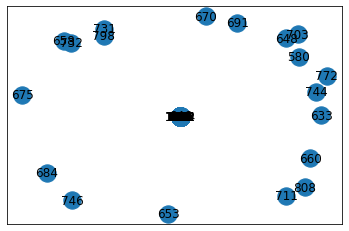
If we do not perform dimension reduction and find a way to make the graph sparser, the graph in Figure 1 is what you will get, which is unreadable at all. Moreover, the node2vec algorithm requires a networkx graph as input.

Figure 1. Original graph
Fourth step: Use node2vec to get embeddings
As you can notice, in the code, I manually calculated a starting point for the vector_size (dimensions) with the order of the graph. This practice is inspired by Google’s Machine Learning Crash Course. And the empirical rule-of-thumb is that the size of dimensions is equal to the fourth root of the possible values.
Fifth step: Visualizing with 3D 360-degree-animated scatter plot
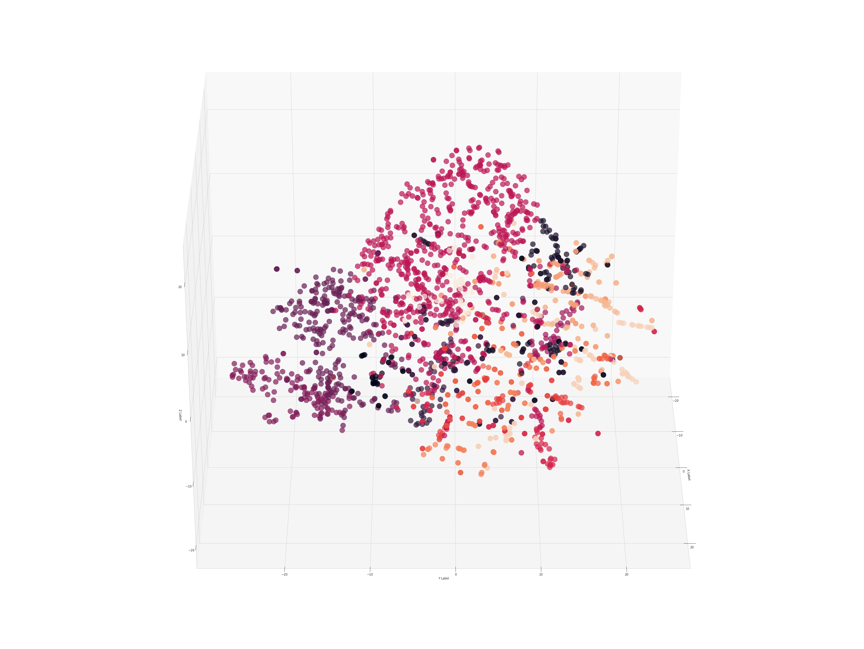
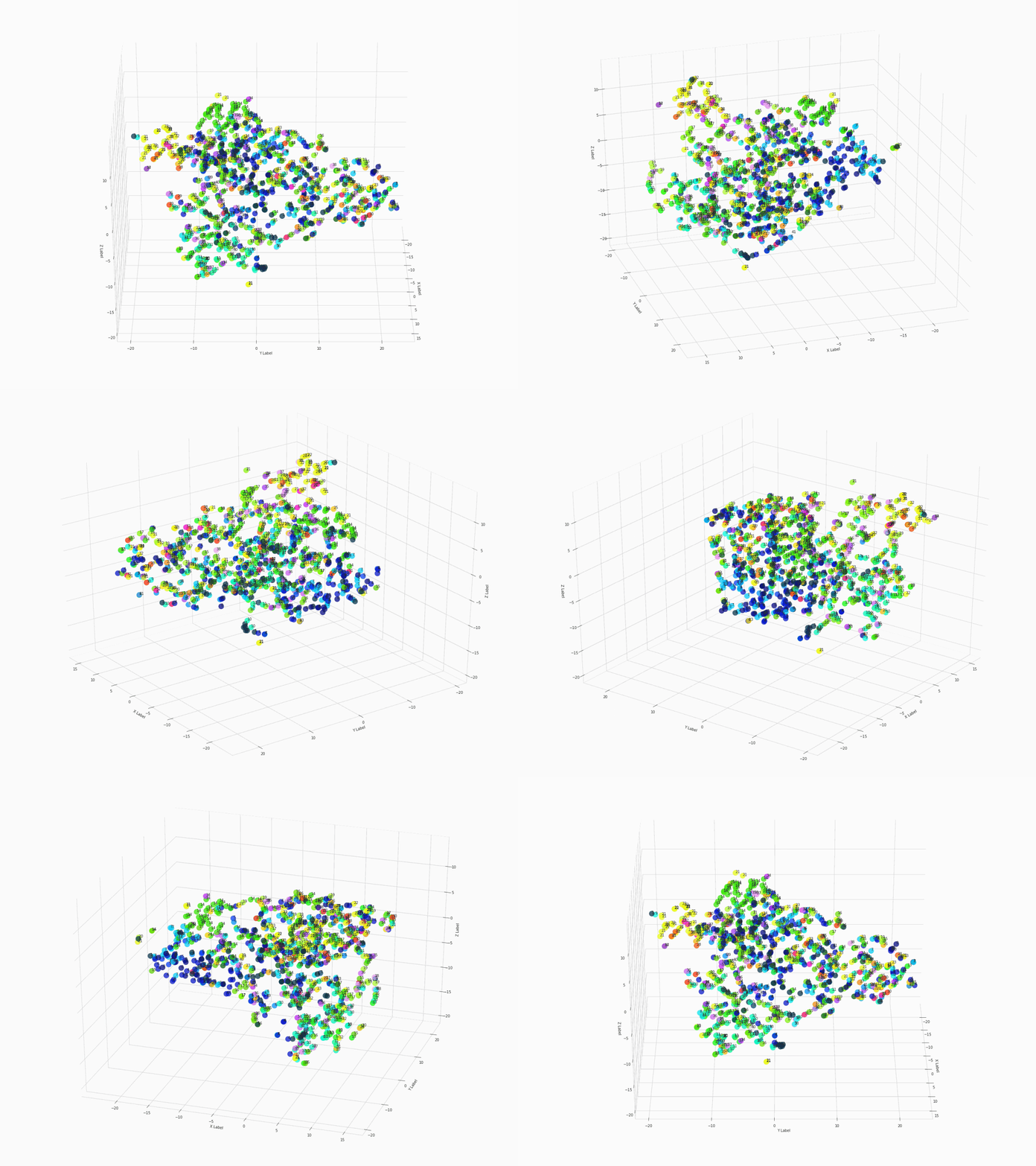
After executing the command of ThreeDplot(model), here is what we got:

Figure 2. 3D 360-degree scatter plot
For a high-resolution graph, visit this link for the original gif.
For reproduction of the results, visit this link for the notebook.
Conclusion
In this blog, we used node2vec, networkx, tsne (pca), seaborn, matlibplot, etc. to make a 3D 360-degree-animated scatter plot to visualize high-dimensional, complex network data.
Related Readings
Analyzing Disease Co-occurrence Using NetworkX, Gephi, and Node2Vec
Network Analysis with R: Manipulating Network Data
NetworkX: Code Demo for Manipulating Subgraphs
What Is Embedding and What Can You Do with It
